As a multi-award winning business based in the UK and USA, we approach each and every challenge with the utmost commitment and enthusiasm. Our new website is one example where we’ve applied our enthusiasm for customer service, to create a new website that is ready to meet our customers’ needs both now and in the future.
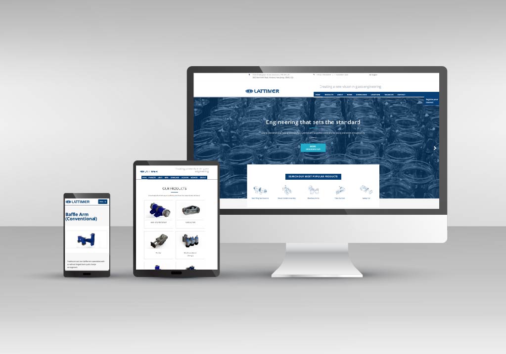
As mobile technology continues to develop at an incredible rate and mobile usage by our customers is increasing year on year, we have created a website with a responsive design, allowing them to access information about our full product range of IS variable equipment in the best possible format for their device they’re using.
A responsive website is one that detects what type of device a visitor is using – for example, a smartphone, a tablet, or a desktop computer. It then responds accordingly by adjusting the different design elements to the screen size of the device browsing the website, delivering a streamlined experience for mobile and desktop users alike.
The responsive design is just one part of our commitment to our customers. We will also be providing our website visitors with useful and informative content via our news section and the ability to access our downloads library to download product brochures and also technical product bulletins. It is our ambition to make the Lattimer website the industry’s leading destination for information and support for IS variable equipment.
See our full range of products by clicking here
Should you need a bespoke product then learn more about our expertise.
Next: Lattimer at Gulf Glass 2017
Previous: Welcome to our new website
Please enter your details below and we will send you the requested brochure.
CREATING A NEW VISION FOR GLASS ENGINEERING
We are Lattimer – a designer and manufacturer of high quality IS variable equipment for the glass container forming industry. Driven by quality and committed to excellent customer satisfaction.
Our commitment to our customers, attention to detail, new product development and our quality, helps make us a supplier you can trust.
Quick
Contact
-02_(1).png)

-01_05.jpg)